Thursday, March 22, 2012
Wednesday, March 21, 2012
50. Evaluation Activity 7 - "Looking back at your preliminary task, what do you feel you have learnt in the progression from it to full product?"
Prelim Task
Thriller Opening (Immolation)
Tuesday, March 20, 2012
Monday, March 19, 2012


Sunday, March 18, 2012
47. Evaluation Activity 4 - "Who would be the audience for your media product?"
 Name: John Smith
Age: 19
Interests and Hobbies: Gigs, listening to music, going out with friends, the cinema.
Favourite Films: Scream (1,2 and 3), The Shining, Shaun of the Dead, The Dark Knight, Scarface
Bio: John is currently at University studying Media Studies. He is sociable, so since starting his course he has made plenty of new friends. Money is tight because of his Uni costs, therefore John has little money to spare on big nights out. He enjoys going to the cinema as it isn't overly expensive and his favourite genre of film are thrillers (as you can see by his favourite films above.) John would love our film as it is a thriller, however it goes against some of the typical stereotypes seen in thriller films. 'Immolation' would be a change for him, aswell as something he would enjoy.
 Name: Rachel Williams
 Age: 16
Interests and Hobbies: Going out with friends, shopping and swimming.
Favourite Films: Inception, The Black Swan, Titanic, Saving Private RyanBio: Rachel is in her last year at school studying her GCSE's.
Exams are stressful therefore Rachel and her friends enjoy going out to take their minds of their studies. She loves going to see horrors/thrillers as she likes the adrenaline rush she gets from them. Rachel and her family also enjoy watching new films on Sky movies and Netflix as it gives them a chance to spend time together and watch the latest movies. Rachel would like our thriller as it has the adrenaline filled narrative which she enjoys.
Exams are stressful therefore Rachel and her friends enjoy going out to take their minds of their studies. She loves going to see horrors/thrillers as she likes the adrenaline rush she gets from them. Rachel and her family also enjoy watching new films on Sky movies and Netflix as it gives them a chance to spend time together and watch the latest movies. Rachel would like our thriller as it has the adrenaline filled narrative which she enjoys.
The age rating for our film is a 15. However the target audience for our film would most likely be 15- 20 year olds. The reasons for this is because although our film contains some graphic images, it isn't overly scary and anyone above the age of 21 may want to go to the cinema to see a more scary film (something that is rated 18+)
Saturday, March 17, 2012


Friday, March 16, 2012
45. Evaluation Activity 2 - "How does your media project represent particular social groups?"

The two images show Penny in our thriller 'Immolation' and also a character from the film 'The Virgin Suicides' As you can see from the photos, the scenes are extremely similar. When coming up with the idea for our thriller, we had never heard of the film 'The Virgin Suicides' however after completing 'Immolation' and doing some research, we can now see the similarities.
Both characters find their lives unbearable and both of their lives result in suicide. They are both teenage girls, living in a regular town. All appears well on the outside, they are both however hiding secrets about how they truely feel.
Both characters suicide is also due to a relationship with a male. In our thriller opening, it is unclear what the actual relationship is between the female and the male. However, in the film ‘The Virgin Suicides’ one of the girls shares a relationship with a guy which is consummated however, her happiness is short lived because he then leaves her and she’s left isolated again.
Also in both ‘Immolation’ and ‘The Virgin Suicides’ the characters that committed suicide are female characters. This suggests that women are more likely to get more emotional and take relationships much more seriously and to heart than a man would.
Thursday, March 15, 2012
44. Evaluation Activity 1 - In what ways does your media product use, develop or challenge forms and conventions of real media products? (i.e. of film openings)"
Title
The title of the film is called ‘Immolation’ which means to sacrifice; this is a perfect name for our thriller as it is based on a girl sacrificing her life, committing suicide. The thriller opens with a title sequence showing our thriller name, this will immediately put a question in the audiences mind, who or what is being sacrificed in this thriller? We didn’t want to use a long name; we wanted a one worded title which summed up what our thriller was based on, so we searched for synonyms and Immolation caught our eye. The title has a black background and white font in capital letters giving it importance, the white contrasts the black which sets the mood for the opening, we realised it wouldn’t be appropriate to use bright colours as it would give the viewer the wrong idea to what genre our film is. A good example that influenced our title is the film ‘Psycho’ which reflects our first frame, both colour and font is similar.

Setting and location
For our thriller we wanted to use a location that wasn’t stereotypical. We brainstormed many places, for example a train station, car park, seaside etc. We finally decided to film a section of our location in a bathroom as it was appropriate to our storyline and it was accessible unlike the seaside. We also filmed in a forest and park, which is stereotypical for a thriller however we wanted to include some common codes and conventions associated with thrillers. We wanted the forest to be surrounded by many trees as it gives it an eerie, foreboding atmosphere and preferably a pond or lake with a bridge as they were in our original storyboard and the lake would link to the bath scene where Penny’s character committed suicide. The image of water represents the theme of purity and we wanted the main character to wash away her sins which is illustrated through her committing suicide. We decided to film at the park where Penny and the unknown male character are taking part in various activities, shown in flashbacks. We decided to film here as it gives a sense of normality to our thriller, like the film ‘Disturbia’.


Costume and props
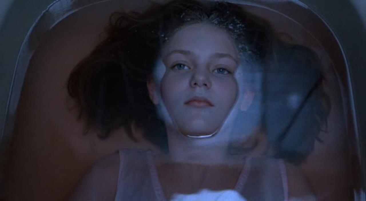
The main character wears three outfits during the whole opening of our thriller. Firstly in the park scene, she is wearing casual clothing and natural make-up to show that this is an everyday setting and situation, giving a sense of normality. Alongside with her is the unknown male character that is also seen wearing casual clothing. In the next scene in the bathroom the main character is wearing casual black and white clothing to commit suicide in; this represents her thoughts as the lack of colour represents her dark emotions and feelings about committing suicide. As she is in a bad state of mind, she is crying and her make-up is run down her face. Finally the main character has come back as a ghost; we wanted to establish this to the audience by dressing her in a black dress, tights and shoes. In our original storyboard we decided to dress her in a stereotypical white dress, seen in many thrillers, however we wanted to go against this and break the conventions as it also fits the mood and gives a sense of death. Her make-up is pale, with dark eyes and red lips, the red lips gives a contrast to the whole outfit and also the colour red has connotations of blood, as she is seen with self-harm wounds. Her hair is wet as she was last seen committing suicide by drowning herself. As you know our group went against the typical thriller conventions as we didn’t want the opening to be cliché and predictable, therefore there are no stereotypical props throughout. Our main prop was a photograph of the main character with the unknown male, which is seen throughout. A prop that links to this is the lighter which is seen being used to burn the photo; this gives a sense of hatred and passion from the audience’s point of view, this creates an enigma to the audience as to why she is doing this. There are also a few shots of a clock before and after the bathroom scene where she commits suicide, we done this to create tension and show the passage of time she was in the bath for. This gives it a sense of reality.


Camera work and editing
During our thriller we used many shots which reflects the main characters thoughts and feelings. In one scene we used a dissolve, from the shot where the main character is in the park with the unknown male, having a good time, which then dissolves into the bathroom scene where the main character is crying. We purposely done this, so you see the main characters face happy and laughing when she is with the male, dissolving into her face crying, alone in the bathroom. This hopefully leaves questions in the audiences mind as to why she is crying, did he make her cry? Or has something happened to him? This hopefully showed the audience her unstable state of mind, questioning whether to commit suicide or not. During the thriller we gave many hints to the audience as to why she is committing suicide, for example there is a shot of her writing a suicide letter to someone, we used a close up here of her writing “I need to be with him” which suggests to the audience the importance of this.


Title font and style
Our group decided to create a title that reflected our thriller storyline. We used a white font on a black background as the connotations of these colours are life and death, which is shown throughout the thriller, images of the main character are seen dead after committing suicide and alive before contemplating her own life. It is in capital letters and in the centre of the frame as we wanted to make this a bold statement just like the meaning ‘to sacrifice’. We felt we didn’t need any fancy font, as it would take away from the meaning of the title. We have made sure this font is consistent throughout.


Story and how the opening sets it up
Our thriller is a super-natural thriller; it opens with a wide shot of the main character walking across a bridge in the forest. To the audience she appears to be an everyday average girl, however if you look closely this isn’t the case, she is a ghost as she has committed suicide. We have shown this through her clothing and make-up. The audience then realise that she is a ghost because later on in the opening we show shots of the girl leading up to the event of her committing suicide which creates enigma and also during the event. Near towards the end of the opening the girl as a ghost in the forest is burning a picture of her and an unknown male, this hopefully grabs the audience’s attention as throughout the opening the picture is seen in other various places, therefore there should be a connection and leave questions in the audiences mind to why she is doing this and why this picture is so important.


Genre and how the opening suggests it
As the genre of our opening is a super-natural thriller, we have tried to show this through the ghosts costume and make-up, pale face, dark, tired eyes and wet hair to relate back to her committing suicide by drowning herself. Super-natural thrillers narrative is based on suspense and tension involving something supernatural and abnormal going against everyday life, i.e. a ghost. We have stuck to the codes and conventions of a super-natural thriller as we have used stereotypical characters and conflicts where there is a connection between a super-natural character and a normal character. Super-natural thrillers also include traces from horror thrillers; we have incorporated this as well by the use of self-harm cuts, etc.


How characters are introduced
The main character is first shown within the first 10 seconds of the opening; there is a wide shot of her walking over a bridge in the forest, we used this as we wanted the audience to see her whole body, costume and the location surrounding her. As this is the first shot shown of her, the audience will make assumptions straight away due to her make-up and clothing; it is abnormal compared to a normal human, which suggests she has super-natural characteristics. Then the unknown male is introduced, he is seen in an everyday normal environment with everyday costume, this shows he isn’t the main character however as he is the only other person shown he is key to the opening. It also ties in with the super-natural conventions as the codes and conventions are that a super-natural character and a normal character interact with each other.


Wednesday, March 14, 2012
43. Spellcheck and consistency of the blog
While I had time, I went through the blog, spellchecking and seeing if it was consistent.
I did find a few spelling mistakes on a few posts and changed them once I had noticed, making them correct. See picture below:

I also found that the blog wasn't consistent all the way through, some text was positioned to the right and some in the centre, we want our blog to be all centered. See picture below:

By Penny Horsnell
Tuesday, March 13, 2012
42. BBFC Final Rating for Immolation

As a group we decided that the most suitable age limit for our thriller opening would be 15+. We decided that this age limit would be most appropriate because we felt that 18 was too high as the opening didn’t contain too much explicit images, however it would be too graphic for a 12 year old to view as it contains shots of someone who has committed suicide.
In the BBFC Classification it states “Imitable behaviour - Dangerous behaviour (for example, hanging, suicide and self-harming) should not dwell on detail which could be copied. Easily accessible weapons should not be glamorised”.
We were particularly concerned about this stipulation because of any possibility that the act of suicide which is represented in the opening of our thriller might be copied by any member of the audience. However we believe that audience members over 15 will be mature enough to deal with these scenes rationally.
Commercially, the 15 certificate suits us well because the 15 - 20 age group is still the major target audience in cinemas. For DVD sales and rentals, we would expect the 15 classification to be retained.
By Tanzila Salam
By Tanzila Salam
Monday, March 12, 2012
41. Final Poster
In our group, we made 5 different posters for our thriller, Immolation. As we liked them all and couldn't decide which poster was most suitable and effective, we thought it was best to let the target audience give us a helping hand and tell us their opinions. We knew our target audience use social networks a lot therefore this was a great opportunity to market our thriller posters and keep everyone up to date with what was going on. We decided to share the posters on Facebook for them to view and comment on. We posted a status saying the following:

After 24 hours, we looked through the pictures to see how many likes each poster had and what the comments were. This would help indicate which poster was the best and what people liked or disliked about them, which would all help us in making the decision about our final poster. Here are screenshots of each picture and some feedback on each:

Total likes: 9

Total likes: 8

Total likes: 29
As you can see from the screenshots above the 3rd poster was most successful with 29 likes and comments such as "This ones the best and most dramatic" therefore this is now our official poster for Immolation!
By Penny Horsnell
Subscribe to:
Comments (Atom)